I taught a class Monday in data visualization for Josh Grimm’s In-Depth Reporting class at LSU.
I’m no expert in data visualization, but I studied the use of interactive databases for the American Press Institute in 2008 and my students experimented with a variety of data viz tools last spring in my course on learning interactive storytelling tools. (I’ll add some links to the students’ posts on data-viz tools later, but I want to get this published now and I won’t have time to add links until later.)
My point in this class is that you can tell stories lots of different ways using data, and that you can teach yourself pretty easily how to use some effective data viz tools. I admire the skills of some data specialists I know, and hope some of our students will follow them into that specialty. But I hope every student (and professional) journalist develops data skills to find and tell stories routinely.
Examples I used in the class (and a few I didn’t have time to use):
- The Advocate’s map of New Orleans Police Department response times (using Google Fusion tables)
- The Advocate’s analysis of Bobby Jindal campaign contributions
- NOLA’s crowdsourcing effort to map New Orleans neighborhood boundaries
- NOLA’s Hurricane Katrina flooding map
- WBRZ’s Baton Rouge crime map
- The Marshall Project’s Next to Die
- The Star Tribune’s project on segregated schools in the Twin Cities
- The Tampa Bay Times’ animated graphic on Florida’s worst schools
- Bloomberg’s What’s Warming the World
- Bloomberg’s How Fast America Changes Its Mind
- Wall Street Journal’s Job Market Tracker
- Washington Post’s calendar of 2015 mass shootings
- Prison Policy Initiative’s States of Incarceration
- Los Angeles News Group’s Los Angeles Earthquakes
- Los Angeles News Group’s shark attacks map
- Redding Searchlight’s eagle map
- Washington Post’s smartest states map
Thanks to Kyle Whitfield, Mark Lorando, Tom Meagher, Maryjo Webster, Daniel Tedford, Kevin Dupuy and Michelle Rogers for providing these examples.
I collected information from the students using a Google Form and used it to create some data visualizations about the class using Infogr.am and Google Maps. I was running out of time and rushed through these pretty quickly, but you can make pretty simple graphics quickly using these tools. I elaborate a bit more here on some of them.
I wasn’t able to embed the resulting Infogr.am graphics in my free WordPress blog (they should embed on most websites). Here are some screen grabs of the graphics (with links below to the interactive versions):

You can see the interactive version of the graphic on devices here.
This pie chart, I noted, would be more effective with graduated shades (perhaps yellow to red) than the random colors assigned to each number:

In a graphic about the students’ use of social media, I tried different data viz tools offered by Infogr.am. This line chart didn’t work for me (though it might work for other detail). An effective graphic makes a point quickly and this one requires some study:

This horizontal bar graph also took a bit of work to understand, but quickly shows that the most popular social tools with the students are Snapchat, Instagram, Facebook and Twitter, and that the students aren’t using Foursquare at all. The graphic on devices was filled out later, when I had 26 responses instead of 24.
I deliberately didn’t update this because it actually illustrates some points you need to check in doing data visualization: The data need to be accurate. My first take of this didn’t have fully accurate data: You can see that I only have 23 responses, instead of 24, on Snapchat and Instagram. Actually, I had 24 responses at the time, but failed to double-check my data before uploading it for the graphic. These are the kinds of errors you need to avoid and double-checking you need to do both before uploading data and after finishing a visualization project.

The most effective graphic on social networks, I thought, was this layered pie chart, where you can (in the interactive version, not the screengrab below) see how differently students use the social tools. It would have been more effective, though, with a gradual color scale, perhaps with yellow for 1, orange for 3 and red for 5, with shades in between at 2 and 4. But I was trying to show how quickly you can make a simple graphic. That’s the first step in data visualization. I’d expect such improvements in subsequent projects.

Moving to Google Maps, I quickly imported information from the spreadsheet of student responses to create a map showing where the students were from (that embed works here):
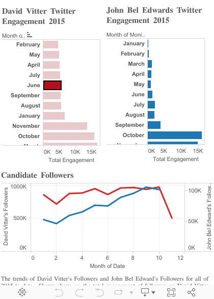
During the class, Deanna Narveson did a quick data viz project on social media engagement by Louisiana gubernatorial candidates:
https://public.tableau.com/javascripts/api/viz_v1.js
Here are my slides from the class:


